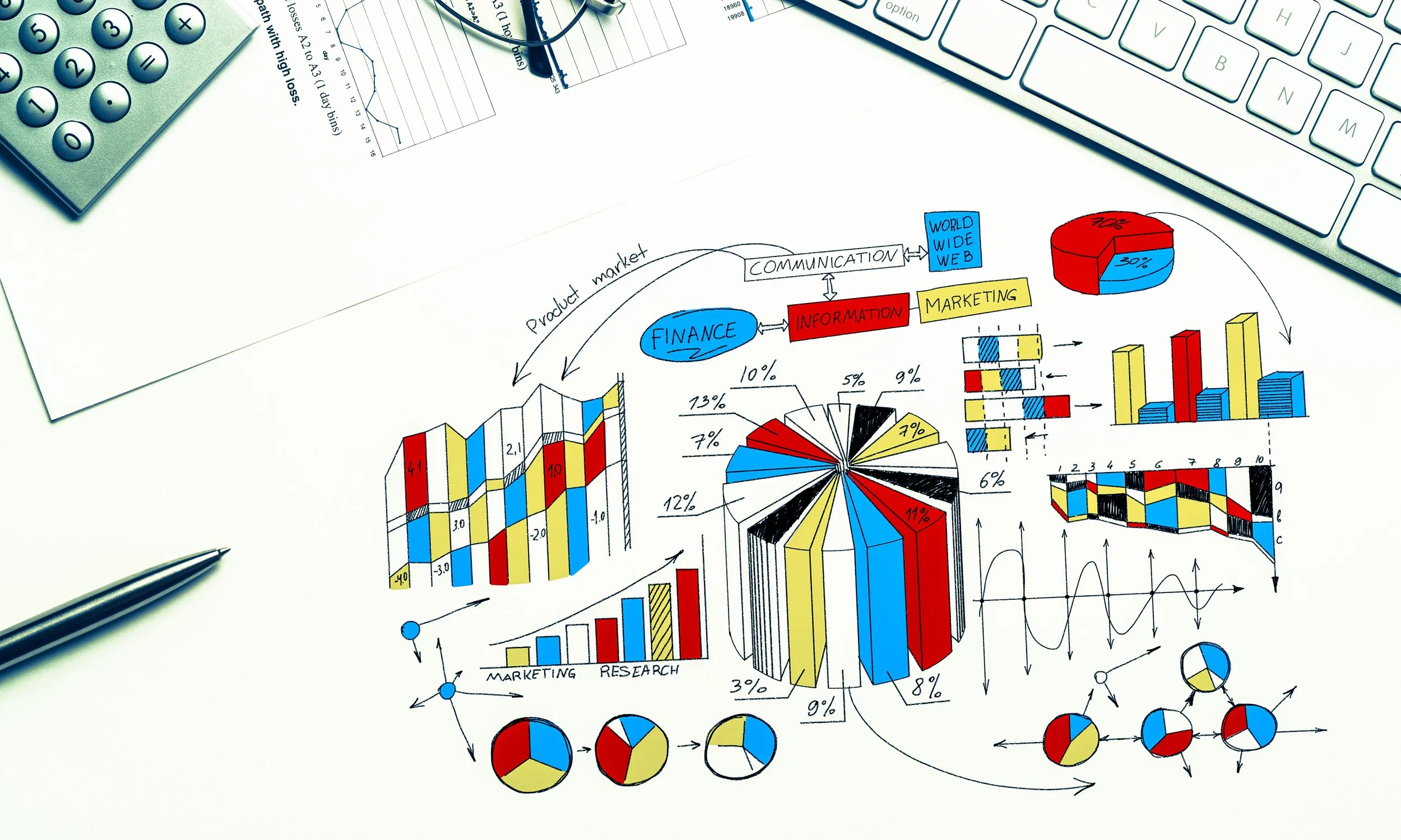
Why Visuals Matter: The Psychology Behind Data Drawing
In a world where data is more abundant than ever, it’s not enough to present raw numbers or spreadsheets and hope they’ll make an impact. Whether you're sharing a company’s performance metrics, explaining complex concepts at an event, or making a pitch, one thing is clear: visuals are powerful tools. But why exactly do visuals matter? What makes them so effective at turning information into stories that resonate? In this post, we’ll dive into the psychology behind visual data, explore why our brains connect with visuals in ways that numbers alone can’t achieve, and show how Data Drawing can transform data into memorable experiences.
The Science of Visual Learning
Our brains are wired to process visual information. In fact, nearly 50% of our brain is involved in visual processing, and it can interpret images in as little as 13 milliseconds! This is because visuals allow us to absorb information quickly and retain it longer. Studies show that people remember up to 80% of what they see and do compared to just 20% of what they read and 10% of what they hear. Visuals give context and emotional cues that pure text or numbers struggle to provide, making complex information accessible and memorable.
This is where Data Drawing shines. By turning data into visual stories, we create a format that aligns with our brain’s natural preference for images. This approach helps audiences not only understand the information but also connect with it on an emotional level.
Why Data Drawing Works
Data Drawing takes traditional data visualization a step further by adding personality and human touch to information. Unlike conventional graphs and charts, which can feel impersonal, Data Drawing uses unconventional shapes, hand-drawn elements, and even illustrations to communicate data. Here’s why this method stands out:
Adds Relatability and Emotion
When data is presented in hand-drawn visuals, it feels more human and approachable. Instead of rigid bar charts or pie charts, audiences see fluid, organic shapes and lines that feel more like an extension of the speaker’s voice. This human touch makes the data feel less intimidating and more personal, which can foster a deeper emotional connection.Increases Engagement Through Uniqueness
Unique visuals capture attention, especially when they stray from the traditional formats. A hand-drawn sketch of metrics or an organic shape for a chart creates curiosity, inviting viewers to take a closer look. Engagement is naturally higher because audiences are intrigued by the “unexpected” in data presentation. When information looks like art, people are more likely to remember it.Simplifies Complexity
Some data is too complex to grasp quickly. Data Drawing simplifies this information through visuals that emphasize the core message rather than the intricate details. Instead of overwhelming audiences with exact figures, it showcases the big picture and key insights, making complex concepts easier to understand at a glance.
The Power of Storytelling with Data Drawing
Storytelling is one of the oldest and most effective ways to communicate information. By combining storytelling with data, you can help audiences see the “why” behind the numbers. Data Drawing serves as a storytelling bridge that turns numbers into relatable narratives. Here’s how it works:
Focus on Key Points
A drawn visualization highlights what matters most. For instance, if a company is celebrating a significant year-over-year growth, a hand-drawn “growth tree” might be more impactful than a detailed bar graph, providing context and drawing attention to the milestone itself.Invoke Shared Experiences
When data visuals depict themes or symbols audiences recognize, they tap into shared experiences, making the information relatable. Imagine a data drawing at a networking event that resembles a “map of connections” showing attendees' professional backgrounds—it instantly resonates with everyone in the room.Make Data Personal
Visuals can transform data into a shared story. By creating badges that represent each attendee’s role or goals, for instance, a networking event becomes less about exchanging business cards and more about sharing aspirations. This builds a sense of community, turning numbers into personal connections.
Applications of Data Drawing: Bringing Your Next Event to Life
Wondering how Data Drawing could make an impact at your next event or presentation? Here are some powerful applications:
Live Event Visuals
Capture the spirit and energy of a conference or workshop with live data drawing. Visualizing data in real time—such as attendee feedback or speaker points—keeps audiences engaged and adds a unique, artistic flair to the event.Personalized Data Badges
For networking or team-building events, personalized Data Badges give each participant a unique “snapshot” of their professional identity. This visual tool not only makes introductions easier but also sparks genuine conversations, moving beyond “What do you do?” to “Tell me about your journey.”Data Workshops
In a hands-on workshop setting, Data Drawing encourages teams to view data differently. By creating visual interpretations of data, participants can break out of conventional thinking, foster creativity, and find new insights that standard graphs may overlook.
Conclusion: Making Data Memorable
In a digital age filled with endless streams of information, visuals have the power to make data stand out. Data Drawing not only helps audiences process and remember information but also connects them emotionally to what they’re learning. Through hand-drawn, personalized, and story-driven visuals, Data Drawing turns data into an experience—a story that sticks long after the presentation is over.
If you’re looking to add a spark to your next event or make data more relatable and engaging, consider the unique power of Data Drawing. Let’s work together to bring your data to life in a way that’s memorable, personal, and meaningful.
Want to know more?
Get in touch to see how Data Drawing can transform your next event into an unforgettable experience.
Ready to take your data storytelling to the next level? Let’s connect!
By embracing the psychology behind visuals and the creativity of Data Drawing, you’ll not only convey information but create lasting impressions. Because at Data Spark, we believe data should do more than inform—it should inspire.
